View more
Back
Akademus
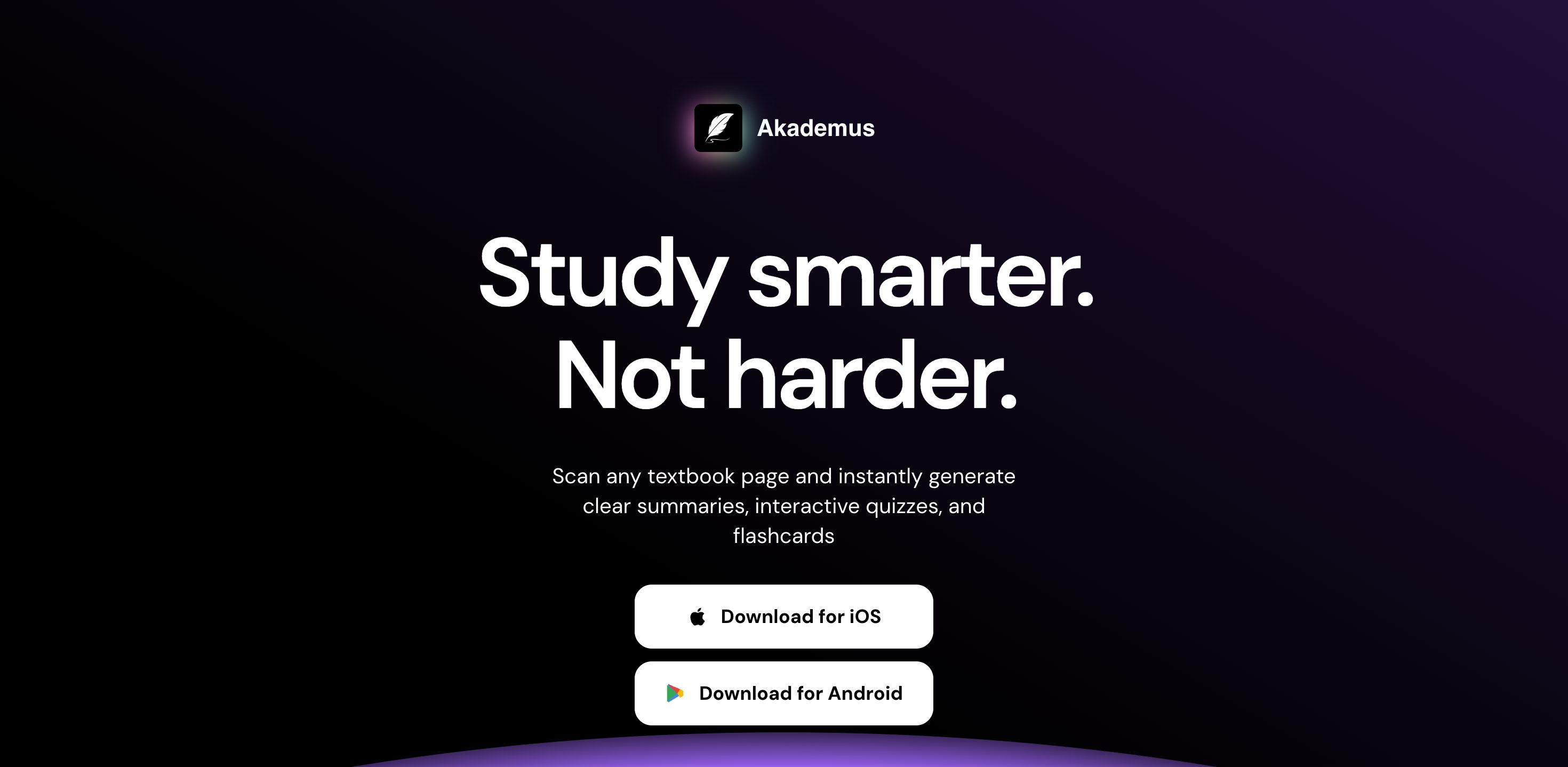
AI-powered study app: scan any page of a book and instantly generate summaries, quizzes and flashcards. A launch site built to drive iOS and Android downloads.
Back
Akademus
AI-powered study app: scan any page of a book and instantly generate summaries, quizzes and flashcards. A launch site built to drive iOS and Android downloads.
AI-powered study app: scan any page of a book and instantly generate summaries, quizzes and flashcards. A launch site built to drive iOS and Android downloads.
Date
February 2026
Duration
6 weeks
Overview
Picture this: you built something incredible. An app that scans any page of a book and, in seconds, generates summaries, quizzes and flashcards ready to study from. The technology works, students love it. There was just one small problem… there was no site that told the story well. And at launch, that is where everything is won or lost.
The product was powerful, but no one got it on the first pass. People landed, didn't grasp the value, and left without downloading. Every visit that didn't turn into an install was a missed opportunity. That is exactly where the Akademus team was when they came to us.
No items found.
The challenge
Here is what they told us on the first call:
"We have an incredible app, but we didn't have a site that explained it well or invited people to download it. People would land and not immediately understand what it was for."
(Translation: they had an excellent product and nothing presenting it at the level it deserved.)
Core problems:
- No clear path: visitors didn't know what the app did or how to start using it.
- Missing trust signals: the launch didn't reflect the real quality of the product.
- Too much information: with so many features (scanning, summaries, quizzes, flashcards), the message got diluted.
- Few downloads: traffic wasn't translating into installs on iOS or Android.
And they reached a breaking point.
There was interest, but it wasn't converting. People didn't grasp the full value before deciding to download. The team knew they couldn't scale like that, not when every new user needed Akademus explained to them by hand.
No items found.
Our strategy
On the strategy call we aligned immediately on the vision: build a digital experience that carries a person from the first impression all the way to downloading the app.
1. Messaging that builds trust
Instead of showing everything at once, we structured the site so the value proposition could be understood in seconds:
- Need to study faster? Here is how.
- Want to see the app in action? We've got you.
We broke each section into simple blocks: how the scanning works, what you generate in seconds, and answers to questions before they come up.
Suddenly, the full potential of Akademus became easy to understand. Trustworthy. Genuinely useful.
2. Design that guides
We gave Akademus a fresh, bright identity — elevated yet approachable.
The target audience was at the center of the strategy: young, ambitious students who want fast results.
The visual language was intentional: color sets the information hierarchy and guides toward the download without overwhelming. Every design decision supports the journey, so a person understands the value before installing the app.
3. Trust through proof
Testimonials from real users. App demonstrations. Screenshots of the product in use. Metrics that back up the result. Because in the end, a person needs to feel: "Right, this really works. This is what I was looking for."
On top of that, the way we work is highly collaborative. A website is a brand's entire world, and we believe in simplifying the process while keeping the client in control.
No items found.
The outcome
The result? Flawless
Downloads started coming in, and people installed the app understanding exactly what it did right away. They had already seen the features, read the testimonials and grasped the value before downloading. The team stopped explaining the product one user at a time and could focus on what really mattered: growth. But the best part wasn't the metrics (though they were strong). It was seeing Akademus finally with a site worthy of the product they already had. A platform that educates, converts and scales alongside the app's growth.
Client notes
"Since the site launched, we've been flooded with comments about how clean, professional and appealing it looks. I recommend working with them one hundred percent."
Ahsan Arshad