view more
Back
Anas Frutos
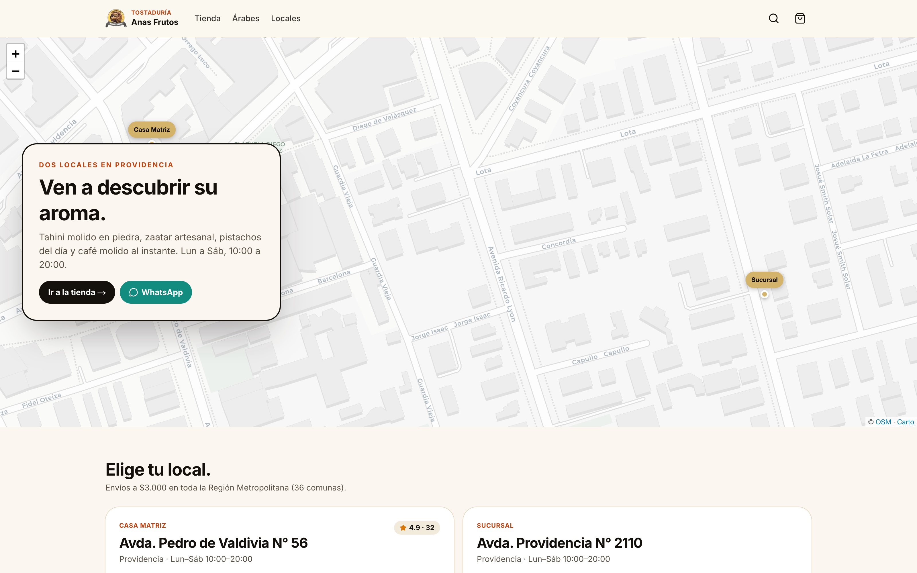
A complete redesign of the Anas Frutos roastery: an online store with a category-based catalog, cart, and a checkout that hands off to WhatsApp to close the sale.
Back
Anas Frutos
A complete redesign of the Anas Frutos roastery: an online store with a category-based catalog, cart, and a checkout that hands off to WhatsApp to close the sale.
A complete redesign of the Anas Frutos roastery: an online store with a category-based catalog, cart, and a checkout that hands off to WhatsApp to close the sale.
Date
March 2026
Duration
6 weeks
Overview
Meet Anas, the owner of Anas Frutos. The business started with a single shop on Pedro de Valdivia, a scale, and an obsession with hand-picking every nut for complementary nutrition. That dedication grew into two stores in Providencia, with hundreds of customers who choose him every day. The catalog? Hundreds of products for every taste.
Anas served hundreds of customers every week, with two stores running at full capacity and a wide catalog of nuts, select seeds, and Arabic-origin products. But here's the thing: when you sell that much every day, there's no time left to build the brand's digital presence and position it against the competition.
No items found.
The challenge
The challenge:
The in-store experience was a world of its own, but the brand had lost touch with what was happening digitally. Its essence got buried under an endless list of products that never conveyed the quality you could feel in the store.
The problem:
Anas Frutos had a site built on a generic template — just enough to exist and bring in the occasional, passive sale. The buying experience came last. The catalog was confusing and unpolished, with no nutritional information, bulk quantities, clear prices, or recipes to discover each ingredient.
The worst part? Every sale ended in a manual WhatsApp conversation, with no checkout and no automation — limited to handling orders person to person, with long response times.
Time was the factor they needed on their side. The commercial system stayed the same; what changed was the internal operational outlook.
No items found.
Our strategy
Our solution:
We activated the catalog interactively, lighting up the key touchpoints of the customer journey to drive the final conversion.
What we built:
A catalog organized by categories for hundreds of products, with search and intuitive filters. We went from “this is what we sell” to “this is exactly what you're looking for” — from a basic storefront to connecting directly with the customer's need.
The goal:
To motivate customers to explore the store, browse more products, and dare to try new ingredients alongside their usual purchases.
Our vision:
We take care of the brand so it looks clean and professional, keeping its signature and understanding its real purpose.
We built a system that works beyond just showing the product: a shopping cart with shipping costs, a checkout integrated with WhatsApp, and automations that bring order to the business and the customer experience.
A collaborative process, where the brand's vision and “soul” stayed intact throughout the build, without losing its reason for being: bringing quality nutrition and products to people looking to improve their daily diet.
No items found.